WG-Gesucht
A revamp of the application "WG-Gesucht" with a new innovative search feature.

Skills
Application Design, UI/UX Design, User Testing, Visual Design, Microinteractions
Methods used
S.W.O.T analysis, User interview, Usability Testing, Competitor analysis, think aloud
Team
Emre Baykal
Supervision
Rebecca Schellhorn
Duration
Okt. 2021 - Dec. 2022
Category
University Project
The idea
Searching for a flat is already challenging, and a poorly designed interface only adds to the frustration. That’s why we chose the "WG-Gesucht" app for a redesign project. Our goal was to give the app a visual overhaul, enhance its usability, and introduce an innovative feature that wasn’t yet part of the product.
What we did
Analyze
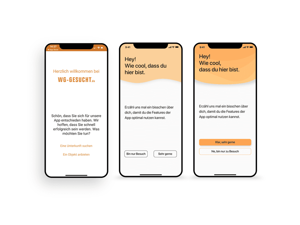
We started by analyzing the user experience for the app's core task—finding a shared flat. We pinpointed significant flaws in the onboarding process and search functionality. We also conducted a competitor analysis to benchmark our redesign against industry standards.
Test
Through user testing, we confirmed our initial findings from desk research and uncovered additional pain points and user needs. We integrated these insights into our new design.
Build
With all our research and insights in hand, we developed the concept, visual design, and an innovative new feature. We also created a prototype to bring our concept to life and test its feasibility.
Where we ended up
We successfully delivered a visual overhaul, introduced a new feature, and restructured the onboarding and search processes for the application.
Visual design
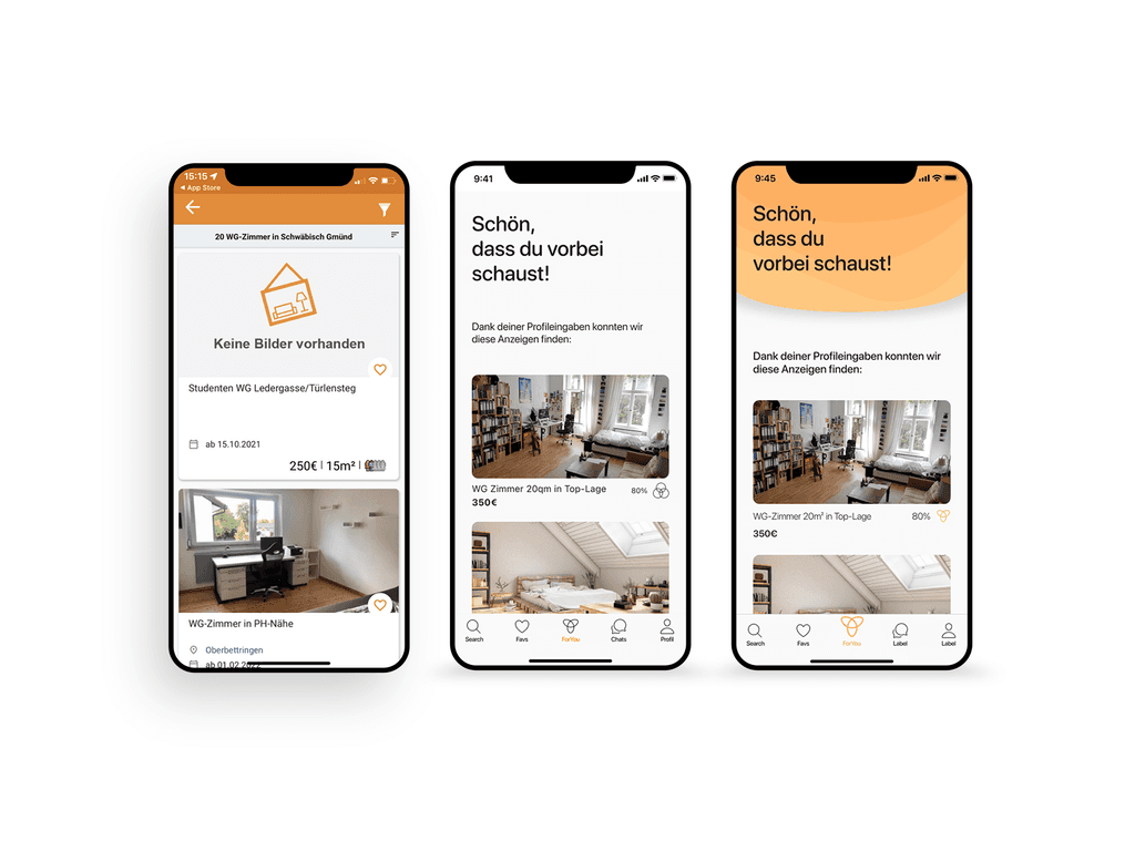
For the visual design, we kept the app’s signature orange color due to its strong association with shared flats. We modernized the UI and overhauled the entire design system to enhance aesthetics and usability. We opted for SF Pro Rounded for its clean, approachable look and excellent readability.
For-You-Search
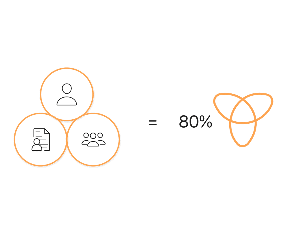
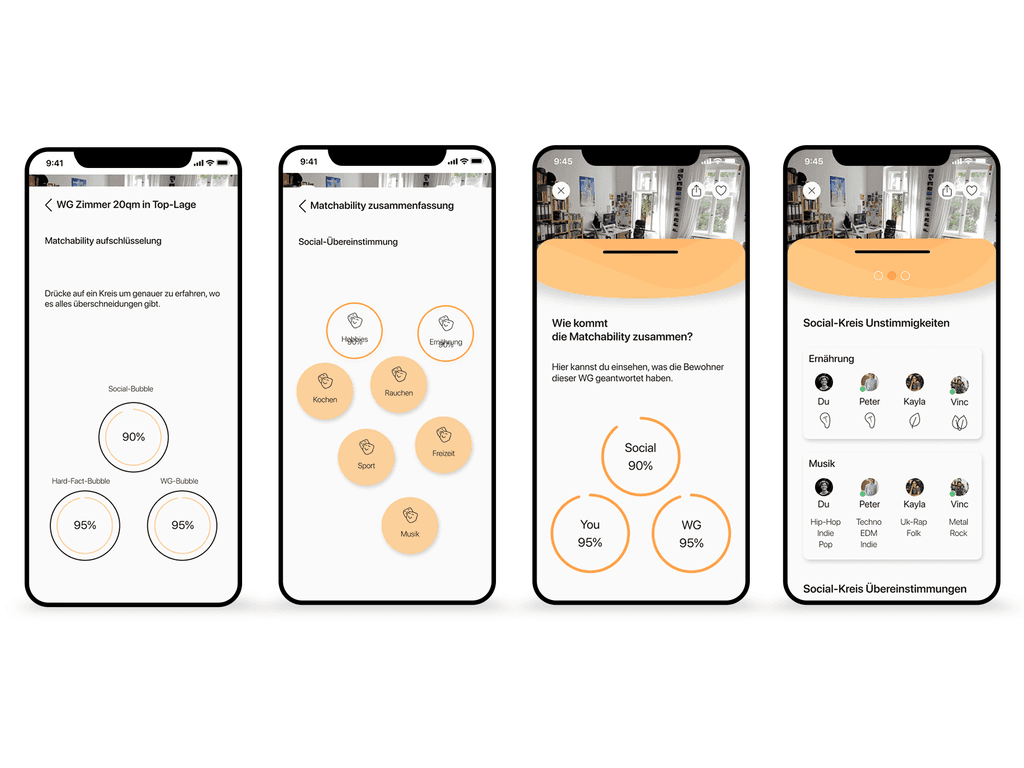
Inspired by social media platforms' "For You" pages, we developed the "For-You-Search" feature. This feature uses a concept we called "matchability" to automatically find shared flats that align with users' interests and preferences.
How the Matchability works
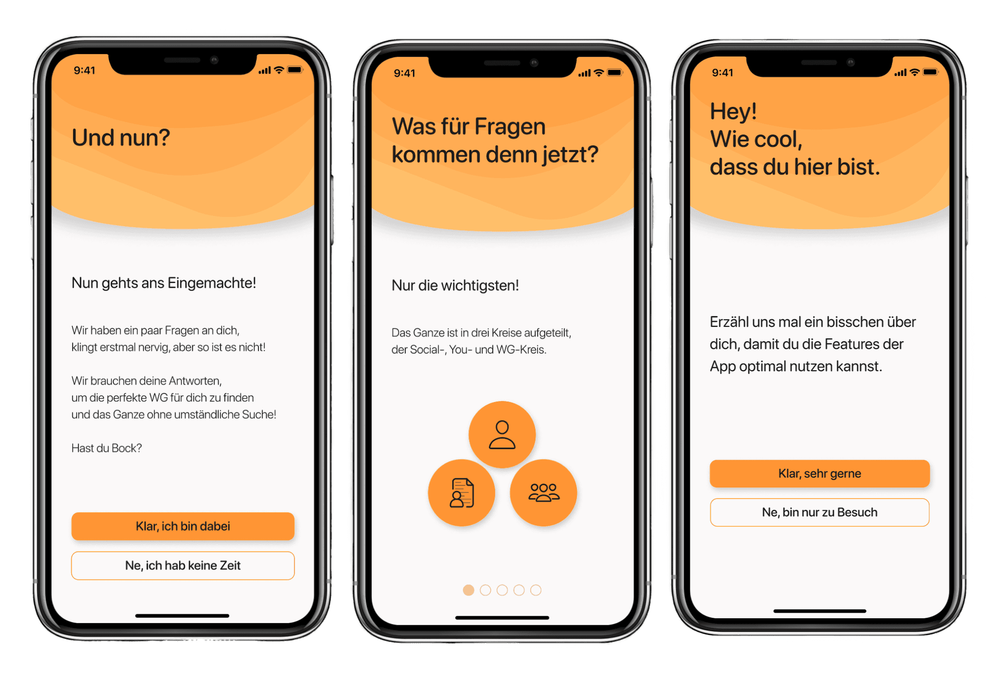
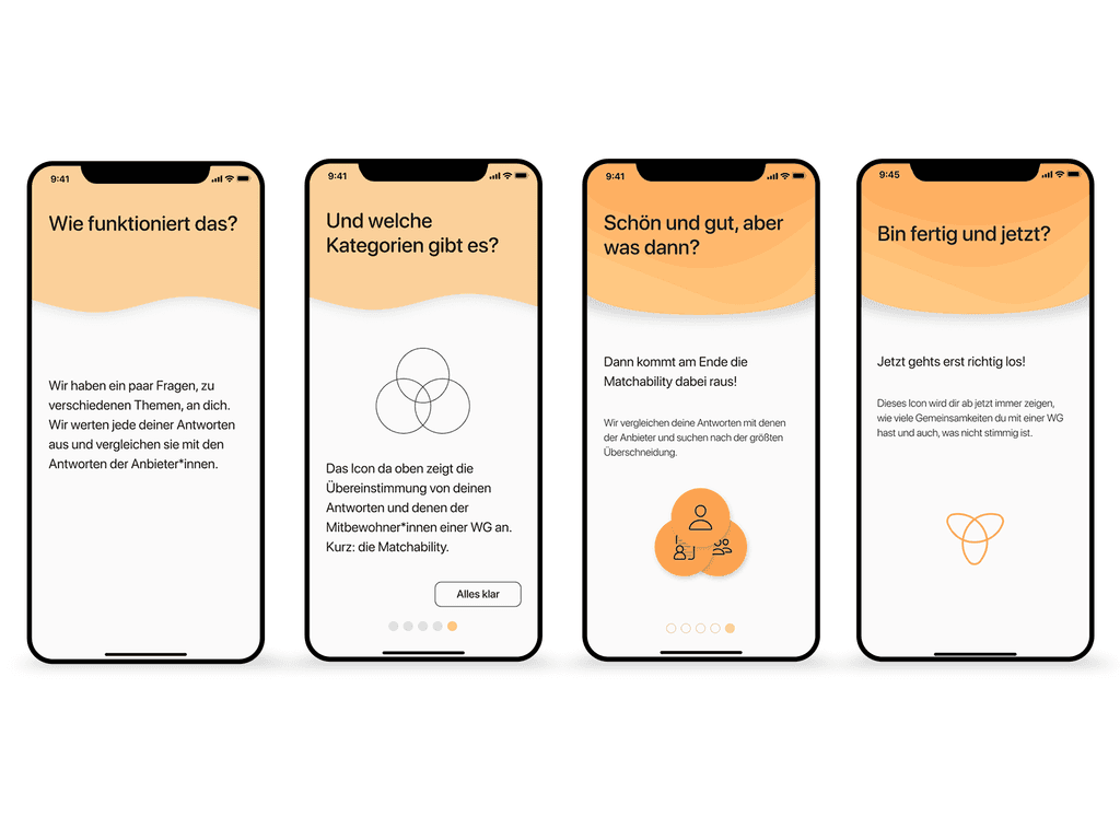
The Data: To make the "For-You-Search" effective, we gathered comprehensive data through an extended introduction process. Users could skip this if they were in a hurry, but both those offering a room and those searching for one provided essential information.
The Score: After the introduction, an algorithm compared the user’s answers with those from shared flats' profiles. This generated a "Matchability score," indicating how well a user matched with a particular flat.
User testing
We rigorously tested our prototype through multiple user tests, refining our design with each iteration. Our focus was on users who had previously been dissatisfied with other flat-sharing apps, particularly due to the lack of detailed information about the people living there. These insights were crucial in shaping our final design.
What I learned
This project was a valuable experience in application design, UI/UX design, and user testing. I learned the critical role of iterative testing and user feedback in refining a product. I also enhanced my skills in concept development, visual design, and creating user-centric features.
Project insights
Some impressions of the project and progress.
